What you will be able to do
- Identify the four questions a visitor needs answered at the top of a service website
- Write a headline, subheadline, button and proof line for your own home page
- Run an eight-second test with five people and act on the results
A visitor arriving on your home page is not reading. They are scanning, usually on a phone, often with three of your competitors open in other tabs. In the first few seconds they decide whether you are the kind of business they were looking for. Think of it as an eight-second window. It is a working rule, not a stopwatch, but it is a useful discipline: if the top of your page cannot answer the visitor’s first questions in that time, the rest of your site rarely gets the chance.
Read the transcript
What a service website must do in eight seconds.
A visitor arriving on your home page is not reading.
They are scanning, usually on a phone, often with three of your competitors open in other tabs.
The four questions every visitor asks.
Whether they are a couple planning a wedding, an office manager booking a holiday party or a venue looking for a reliable caterer, visitors arrive with the same four questions.
The top of your page has to answer all of them.
What belongs above the fold.
"Above the fold" is what a visitor sees before scrolling.
On a phone it is small, roughly a headline, a line or two of text, one image and one button.
Worked example: Lantern and Lane's hero section.
Lantern and Lane's old home page opened with a full-screen slider of three venue photos and the line "Beautiful, stress-free weddings".
Under it sat a "Learn more" button that led to an About page.
The eight-second test.
You cannot judge your own home page, because you already know the answers.
Borrow five people who fit your client profile, or as close as you can get, and run this test.
Headlines for every kind of vendor.
A useful formula is who you serve + the outcome they want, followed by a subheadline of what you do + where.
Caterer: "Food your guests will still talk about at the next wedding." Subheadline: "Full-service South Asian and fusion catering for weddings of 150 to 600 in Brampton, Mississauga and Toronto."
That is the lesson. The worksheet and the quiz are just below this video.
The four questions every visitor asks
Whether they are a couple planning a wedding, an office manager booking a holiday party or a venue looking for a reliable caterer, visitors arrive with the same four questions. The top of your page has to answer all of them.

- Who is this for? Does this business work with people like me and events like mine?
- What do they do? In plain words, what service is on offer?
- Where? Do they serve my city, my venue, my part of the GTA?
- What do I do next? How do I check a date, see prices or get in touch?
A fifth question follows close behind: can I trust them? You do not need to answer it fully in eight seconds, but one visible piece of proof, such as a short review line or a number of events delivered, tells the visitor the answer is further down.
What belongs above the fold
“Above the fold” is what a visitor sees before scrolling. On a phone it is small, roughly a headline, a line or two of text, one image and one button. Every element has to earn its place.
| Element | Its job | Weak | Strong |
|---|---|---|---|
| Headline | Say who you serve and the outcome | “Creating unforgettable moments” | “Corporate magic that gets your team talking” |
| Subheadline | Say what you do and where | “Welcome to our website” | “Close-up and stage magic for company events across Toronto and the GTA” |
| Image | Show the experience, with people | A stock photo of champagne glasses | Your own photo of guests reacting at a real event |
| Main button | One clear next step | “Learn more” | “Check your date” |
| Proof line | Give a reason to keep reading | “Professional and reliable” | “Over 300 office parties and galas since 2015” |
Notice what is missing: a rotating slider, a paragraph about your passion, a menu with fourteen items. Sliders split attention and most visitors never see the second slide. Passion is assumed. Long menus belong in a simple navigation bar, not in the visitor’s face.
Worked example: Lantern & Lane’s hero section
Lantern & Lane’s old home page opened with a full-screen slider of three venue photos and the line “Beautiful, stress-free weddings”. Under it sat a “Learn more” button that led to an About page. Nothing told a visitor that the studio specialized in two-tradition weddings, the position the founders had worked hard to define.
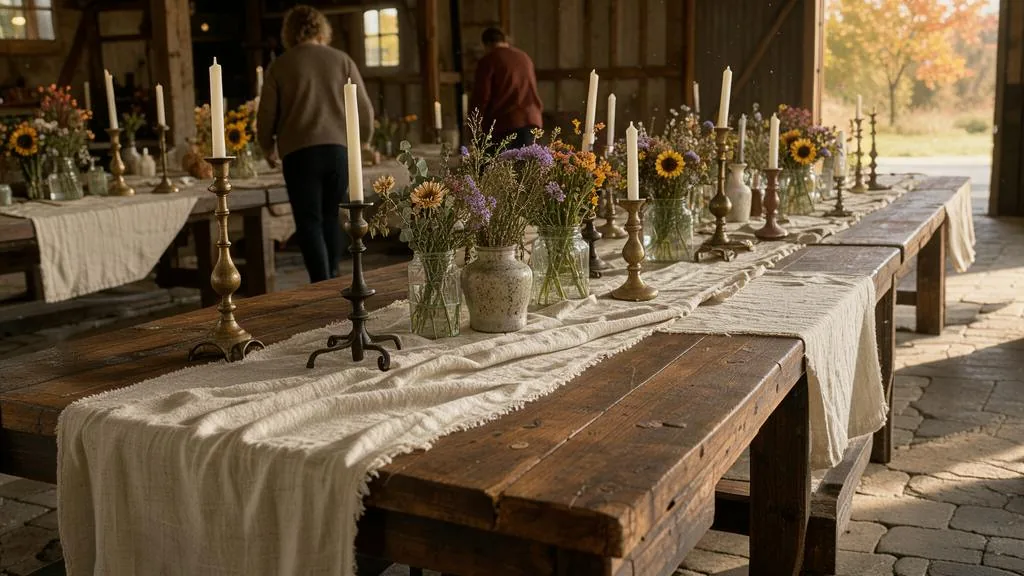
Priya rewrote the top of the page:
- Headline: Two families, two traditions, one weekend that feels like everyone’s.
- Subheadline: Wedding planning for multicultural couples in Toronto and Peel. Both ceremonies and the reception, planned as one weekend.
- Image: One photo of two grandmothers laughing together at a reception, taken by a photographer who gave written permission.
- Button: Check your date.
- Proof line: Eleven two-tradition weddings planned in the last two years.
Now the arithmetic, using illustrative figures. The site gets about 400 visitors a month. With the old page, about 1 percent sent an inquiry: four a month. Suppose the new page lifts that to 1.75 percent, or seven a month. That is three extra inquiries a month, 36 a year. At Lantern & Lane’s close rate of 25 percent, that is nine more bookings. At the studio’s average booking value of about $5,800, the rewrite is worth roughly $52,000 a year, from words and one photo. Your own numbers will differ. The point is that small changes in the inquiry rate multiply through everything else.
The eight-second test
You cannot judge your own home page, because you already know the answers. Borrow five people who fit your client profile, or as close as you can get, and run this test.
- Open your home page on their phone, not yours.
- Let them look for eight seconds, then take the phone away.
- Ask: “Who is this business for?”
- Ask: “What do they do, and where?”
- Ask: “If you wanted to hire them, what would you do next?”
- Ask: “Is there anything that made you trust them, or not?”
Write their answers down word for word. If three of the five cannot answer a question, the top of your page is not answering it either. Fix that question first, then test again with new people.
Headlines for every kind of vendor
A useful formula is who you serve + the outcome they want, followed by a subheadline of what you do + where.

- Caterer: “Food your guests will still talk about at the next wedding.” Subheadline: “Full-service South Asian and fusion catering for weddings of 150 to 600 in Brampton, Mississauga and Toronto.”
- Photographer: “Photos of the moments you were too busy to see.” Subheadline: “Documentary wedding photography in Toronto and Prince Edward County.”
- Venue: “A downtown room that feels like a private home.” Subheadline: “An event space for dinners and receptions of 40 to 120 guests in the Distillery District.”
- Rental company: “Everything for the tent, delivered and set by noon.” Subheadline: “Tents, tables, chairs and lighting across Halton and Hamilton.”
- DJ: “A full dance floor for every generation in the room.” Subheadline: “Wedding and party DJs for Toronto, York and Durham.”
A quick checklist
- Can a stranger say who you serve, what you do and where, after eight seconds on a phone?
- Is there one main button, with words that describe the action?
- Is the main image your own work, showing people?
- Is there one visible piece of proof above the fold?
- Is your phone number or contact link reachable with one tap?
- Have you removed sliders, autoplaying sound and pop-ups that appear before the visitor has read anything?
In Canada and the GTA
Say where in plain place names. The GTA is not one market, and clients rarely search for “the GTA”. They search for their city or region: Toronto, Mississauga, Brampton, Vaughan, Markham, Oakville, Pickering. A subheadline that names the two or three areas you most want to serve tells a visitor in Burlington, or a corporate buyer in North York, whether you are local to them. It also reinforces the service area you set on your Google Business Profile, which Google says should not extend farther than about two hours of driving time from your base. Promise only the areas you genuinely serve.
Headline claims are advertising. The top of your home page is the most prominent statement you make, and Canadian law reads it that way. Under the Competition Act it is reviewable conduct to make a representation to the public that is false or misleading in a material respect. Ad Standards’ Code judges truthfulness by the general impression an ad conveys, not by intent, and disclaimers must not contradict the more prominent message. “Toronto’s number one wedding planner” or “the GTA’s best-reviewed DJ” are factual claims. Unless you can prove them, and keep proving them as rankings change, use a specific, true proof line instead: a number of events, a year founded, a quoted review. The Competition Bureau’s guide to deceptive marketing explains the rules and penalties.
Use the same name everywhere. Google requires the name on your Business Profile to match the real-world name on your signage and stationery, with no taglines, service descriptions or locations added. Put that same name in your site header and logo, and keep the descriptive words for the headline and subheadline. A visitor who clicks from your profile to your site should never wonder whether they have landed on the right business.
Prices near the top must be all-in. If you show a starting price in the hero section, the drip pricing rule applies to it. It must include every mandatory fee, with only taxes such as HST added on top, and a real client must be able to book it.
Market realities
Many audiences, one page. The GTA is home to many cultural and language communities, and event clients often come to you through family and community networks. If you serve a particular community, show it plainly in your photos and words. Some vendors add a line such as “We also speak Punjabi, Tagalog and Portuguese” near the contact button, which answers a real question for many families. Only list languages someone on your team can actually use on a call.
French. Most GTA event businesses publish in English. If you serve francophone clients, or corporate and government clients who work in both languages, a French version of your key pages can be a genuine advantage. If you sell into Quebec, check that province’s language rules before you advertise there, because they differ from Ontario’s.
Who visits, and when. Couples often browse on phones in the evening and on weekends. Corporate buyers often browse at work on a desktop, then forward your link to a manager. Test your hero section on both. A headline that wraps into six lines on a small phone is not doing its job, however good it looks on a laptop.
Change the message with the season. Consider updating the hero section a few times a year. In winter, during wedding show season, lead with next summer’s dates. From late summer, corporate vendors can lead with holiday parties. Keep the position the same and change only the example and the button, such as “Check December availability”. This is general information, not legal advice; ask a lawyer before making comparative or superlative claims you cannot document.
Worksheet
Download the worksheet and complete it for your own business, using Lantern & Lane as the model where it helps. Keep it with your marketing plan. It takes about 10 minutes.

Check your understanding
Related guides, venues and vendors

The venue website and inquiry flow
Specialist Track: Marketing for Venues · 15 min
A venue website has one job: turn the right visitors into tours. Learn which pages and facts planners and couples look for…
Read more
What marketing is (and is not) for a service business
Module 1: Marketing Foundations · 15 min
Marketing for an event business is the work of making the right clients know you, trust you and ask you for a…
Read more
Writing service pages that convert
Module 6: A Website That Books · 15 min
A service page should do the selling you would do on a first call. Learn the questions every buyer is asking, an…
Read more